
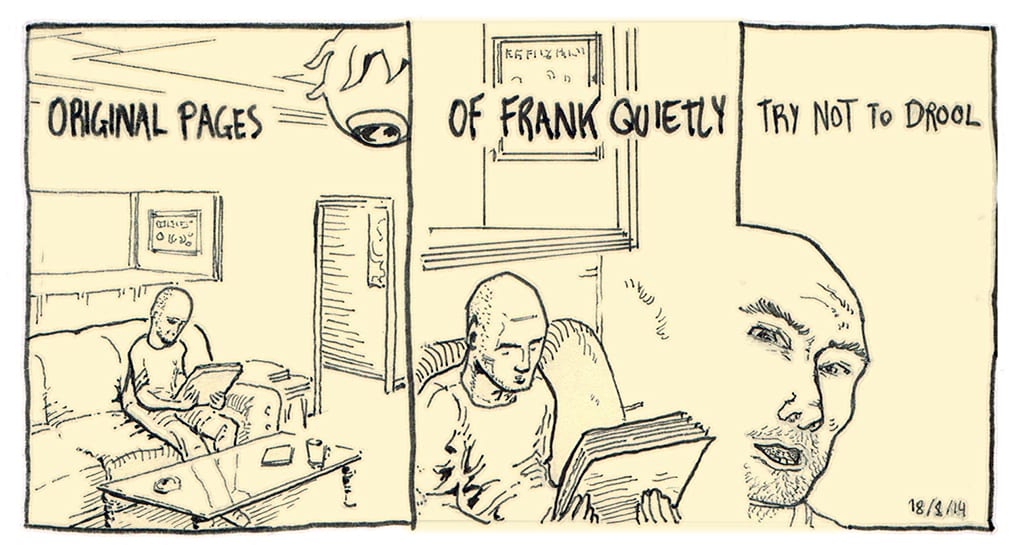
I gushed at length in a previous blog entry about my visit in August with Frank Quitely in his Glasgow studio. I have finally finished typing up our chat and his review of my sample pages, only four months later. Slow fingers. I’ve taken out all the irrelevant bits and present it here, with the pages we were looking at, and the changes he has suggested. Hopefully it makes sense. There are some golden nuggets of advice here for all artists and visual storytellers.
1994 PAGE 9


Frank– I probably say this all the time, but this kinda feels like its going from right to left. Maybe partly because its tipping that way, maybe partly because it looks like that’s the back of the chair, the bit his back would be leaning on, so it kinda suggests its going that way. As a general rule I always tend to make everything go left to right, unless theres a reason. Like here, where Grant says so and they’ve gotta go right to left. (Frank shows the original art of page 6 from Pax Americana.) ((Note- if you haven’t seen this comic yet, go out and buy it immediately.)) But there are a number of different things I did to make that still work. You know, because that really goes against the grain with me. As it is, its even the dialogue in the script reflects the fact that they’re moving backwards through a situation.
Darren– Do you have to know what text will go on and where the balloons will go?
Frank– I prefer to know, but its common for me to be working on draft script with incomplete dialogue. As i have a rough idea it helps.
Darren– A lot of stuff that I’m working on for the doctorate is autobiographical and obviously its not in a mainstream style. I’ll never be working on Superman, I’m focusing on mainly mundane kind of things.
Frank– But there’s a uniformity to it to the look of it, to the line you’re using, to the way you’re using greys, that pulls it all together. I think if you started picking out one or two characters or details and using photo reference for them and leaving the rest of it plain, i think that would be problematic, but I actually think it works.
Darren– Do you use much photo reference yourself?
Frank– Only where I really have to, if I need a picture of the White House or a specific kind of car or something like that. So I use photo reference, but even at that I’ll get a picture of a Mustang or whatever and I’ll draw it from a slightly different angle from the way it is in the photograph. Apart from the rare occasions where the photograph’s exactly the angle I want.
Darren– I’m also interested in your use of perspective, it seems a lot of the time you’re using one-point, and its really clear, it works, and I’m wondering what your thoughts are on that.
Frank– Again, sometimes you want a view of a room where you see a couple of walls and for whatever reason you pick a high angle or a low angle and you want diagonally one half of the room and it makes sense to use two or three point perspective. Very often, although its a laborious process getting the pages to work the way i want them to I find that, generally speaking I’m always trying to simplify things. Very often its satisfying to use one point perspective because usually then you’ve got a simpler composition, and as often as not the focal point will be in the centre, or the focal point will be a character or a prop or whatever, which again if its the focal point will very often be in the centre. When you consider how quickly people read through a comic, spending, say, three or four seconds on a page, the idea of having things where they always flow from left to right, where the natural focus of any given frame where your eye is drawn to is also the focus of the story in terms of plot or whatever at that moment in the story. Its tempting when you’re spending hours and hours on each panel and you’re drawing and working out a sequence to try and make us see as many different things on each panel as you can, but I find as you’re drawing this stuff, its better if you can keep simplifying, keep being as direct, subtly as direct as possible all the time.
1994 (PAGE 8)


Darren– In this one I wanted to show the feeling of disconnection at the end, and loneliness.
Frank– Its nice. I would have considered, maybe, starting to fade out the background, maybe very subtly there (panel three) and then considerably more here (panel four). But, I think I would have probably gone against that. You know, considered that, and then decided just to leave the blank background to the last panel. Which is what you’ve done, and you might’ve done it intuitively. Presumably he’s been feeling slightly lonely and disconnected since he took on board the fact that he was moving, and now he’s talking to his friend about it, so he’s already feeling this way and it makes sense that it’s not until they actually start drifting physically apart… when he’s physically being left on his own that that would kind of crystallise the feelings that he had anyway. So I would have considered fading it out gradually and I would have ended up going with that. But, again, each of those panels individually, I would flip them, because even though you know he’s moving, and the visual flow of the comic is going this direction, the fact is, if everything was flipped, it would always be moving in the direction the comic was flowing in, and then he would be standing still, on his own, in white space as his friend leaves him… so… (laughs) it makes perfect sense that way it is. It’s just for me, for that tiny extra subliminal satisfaction that I get from comics, where you don’t even notice how they’re working, I would do that.
1994 (PAGE 7)

Darren– In this one I was trying to show a long distance phone call.
Frank– That’s really nice. Really effective. Kind of, you can use this as an example of what I was just talking about, about keeping it simple. That’s a really nice, simple presentation, you know like, explaining the idea. In a way its kind of superfluous to what’s actually going on, and whats being said, but it just ties it together really nicely.
BURNOUT (PAGE 6)


Darren– In the other pages I was working on A5 and this one I worked at A3. This cuts between two different characters.
Frank– Yeah that’s nice, I don’t see anything obvious that I would change. Being really picky…
Darren– Please.
Frank– You’ve got a very perfunctory kind of a stage setting (on panel three). And given that, you know, its a pretty cool thing, of someone taking off in this fashion, having a perspective maybe somewhere high off panel might help channel some of that. You know, to give you that sensation of a rush of force. I mean if you imagine standing at street level and seeing someone shooting up the side of a building, or up between the buildings, it would be pretty spectacular, and it would be following the perspective of your eye as you look up. And similarly, it doesn’t take a huge amount of time in a panel that small to put in the buildings in the background if you needed them. If you had enough detail in the buildings that were framing the ascent then the silhouette would work perfectly well, but whether you kept the silhouette or put in perspective detail in the buildings, the idea of just making them look that bit more realistic i think helps sell it. Its that way sometimes where you see superhero artists, for instance, drawing two superheroes slugging it out in the street, and they do a really nice job of the two guys fighting, and then the people on the sidewalk are like mannequins. Maybe a couple in the mid-ground are showing some kind of expression or reaction, but everyone in the background are just like mannequins. And the fact is, every single person in the street, like a Norman Rockwell painting, could be engaged in some way, or be still reading the paper and ignoring, or missing it completely. But that would help sell it. And similarly, the perspective for that corridor (panel 4) is super simple one point perspective, something that I use all the time, but it does have a first draft look about it. I mean, literally an extra five minutes investment. Again, its that way, people notice things more when they’re not quite right. Its like you notice the dirty fish tank in a way that you don’t really notice the clean fish tank.
Darren– So some architraves or extra detail?
Frank– No, not even, just the fact it looks like its an infinitely long corridor, as if those points would meet just behind her head, but it also seems very close to us. I think at that angle the doors wouldn’t be as wide as that. Also, what i find is that people tend to be very forgiving of art styles, in terms of the type of finish we use, the type of hatching, how good the anatomy is. But with some things, like perspective and anatomy to some extent, particularly if you’re doing something that has a bit of an adult theme, not necessarily in terms of content but in terms of approach, if its kind of a thoughtful read, sometimes spending that little bit longer on things like perspective and anatomy can help sell the idea, or the story as well. And similarly that (panel eight) looks like you hadn’t quite made up your mind about the perspective you were using. And again, you’ve got someone flying above a city, so if you block it in like this as a simple representation of a city, if you just make it… you don’t need to go full Akira and do the whole city, but even just a close up of the top of a building thats got an advertising board or something and some cables or whatever, just that fact that it’s real, you know? Rather than a backdrop.
Darren– Yep. Often with backgrounds and buildings I think I’ll just fudge it, I’m sure it’ll be fine, and then at the end I think, I should’ve spent the time.
THE CIRCLE OF LOVE

Darren– I’ve made a short diary comic every day since last November, just as a daily practice. In this one I’m trying to get the reader to look around the page in a different way. I’ve seen some of the stuff David Mack does in Kabuki and it actually had me turning the page around and I thought, ‘how can you get the reader to want to do that?’
Frank– Its really nice. I don’t know if its a conscious decision or not but its good that you chose to work in a much heavier line than the previous page because when you start reducing it its still working, even at a smaller scale. Its always interesting, as it always is with these kind of things where, when you’re looking at it at its biggest, you’re looking at the mark making, you’re looking at the pictures itself, you’re looking into it like a scene the way you would watch television or a movie, but you’re also looking at it the way you like to look at a drawing- you’re admiring the way its been done, these folds here, and the suggestion of big inky strokes here, and a more definite pen mark here. But once you get down to this size (the middle ring) you start dividing your attention between the overall figure and the background and the overall composition, and then by here (inner ring) you’re really looking more at areas of light and dark. Its nice.
Darren– I don’t know how many people are looking at it that closely (laughing).
Frank– Well, all other artists as far as I’m aware. I can’t look at anyone’s art, whether I like it or not, without actually imagining myself making these kind of marks. Sometimes when you’re looking at other people’s work you’re thinking, ‘oh I would have done that in a different way’, or sometimes you think, ‘oh yeah’, just because you know what type of marks are being made or sometimes you can guess at what kind of pen or brush is being used. And you can see when, the whites have been left because of the negative space, rather than being added later. I mean, I can’t help noticing that kind of stuff.
ES IST KALT

Darren– This one is another diary comic done in blue ink and wash in the beginning, and then a black ink pen afterwards.
Frank– Its nice, its got a kind of Genie look. It’s funny because you were saying earlier about not having the kind of style where you’d be drawing Superman, but it never ceases to amaze me how everybody’s style kinda suits personal work, like diary style work or whatever. That’s really nice.
DISAPPOINTING DIET

Darren– Here I was playing around with, you know, if something’s in another language then you don’t really understand it. Its kind of, in the background.
Frank– That’s good, that’s really good. This is great.
Darren– Yeah i didn’t quite capture the actually look of horror on her face (laughing).
Frank– No, but the thing is, the way that works for me is, she’s half trying to keep on a mask, or put up a front, and she’s half stunned, beyond her own control anyway. And then she regains it enough to give this nearly smile with a mouth, and nearly hiding it with the eyes. It works really well, and this vegetarian alarm thing works really well. I like the fact that the style of the diary comics keeps changing.
LOOK INSIDE AND DIG DEEP


Darren– I’m quite mad on bike riding and also, colour’s a new ground for me.
Frank– Is it mostly on road?
Darren– Yeah, road bikes. Here I’m playing with colour. Your coloured stuff is so great… I don’t know how you do it! I’m wondering, how do you tie a page together with colour?
Frank– This is really nice. Did you do this on paper or digitally?
Darren– So this is on paper and then the lettering and these little things (indicating the captions) were digital. These are also on A5, pretty small.
Frank– If I’d done that for a diary comic I’d be perfectly happy with it. If I was redoing it for a broader publication, and I was doing the colouring, I’d probably have the linework fading back, away from black, towards a neutral or warm grey, or towards a blue nearer the horizon. The way I would normally go about something like that is, I’d start it in pencil the way I did the Sandman pages, and then I’d do the lifework for the darkest blacks and then the rest of the linework I’d either use coloured inks or pencil, you know, fading back into the background. And also in terms of, sometimes what you’re drawing in the panel, dictates what the colours are going to be like anyway, you know if its night time and people are sitting around a campfire, you know roughly the way its gonna go. Just as an aside, if I’ve got a large image to colour, and lets just say for instance its a crowd scene. The first time this came home to me was years ago, I did a piece for an art shop and it was a Geoff Darrow/Where’s Wally style crowd scene outside of the shop with loads of people. And when I went to colour it, I was colouring with liquid acrylics, or water colours, or a combination, and I thought ‘where do I start with this?’ So I decided what I would do was I would deal with all the colours that I knew first, particularly with the neutrals, so I did all the skin on all the people, I did the grey tarmac of the road, I did all the blue denim, all the brown or black leather, all the white t-shirts or the white office shirts, and then if there were yellow lines in the road or a red pillar box, or the colours of the shop front, I put in all those colours where I wouldn’t be allowed to change things. And then after that I was left with all the T-shirts and scarves and hats and cars and things so it was a question of actually finding a balance that I liked, because I knew I only had one shot at each thing.
Darren– And you look to balance it out?
Frank– Oh yeah, unless there’s a reason not to. I mean, you take a photograph of a crowd scene or a busy street or something and you might find that you’ve got three red cars down here, and four people with red jackets. And it’s not the way you would arrange a painting, or arrange a photoshoot, if there was a choice. And obviously if you’re colouring it yourself. Unless there’s a reason to be doing that, say if there’s a wee pocket of red gravity somewhere (laughs).
SUBURBAN SUNSETS

Darren– Here I’m playing around with copic markers, just trying to get more confidence with colour.
Frank– Thats really nice. Just, you know, ignoring the art work and the aesthetics, and just dealing with it as a wee three panel piece, this is actually really lovely, because this is something thats familiar to everybody. This (pointing to panel one) runs into this (panel two) but this is suggestive of being back indoors, because this looks like a human figure, rather than the hillside beyond the trees which is what I thought it was when I started reading it. But what you’re talking about is the day moving into the evening, and the whole thing works in perfect sequence. The suburban sunsets, all the detail in this panel, everything that’s not sky is a silhouette of suburbia where this is happening. Even the fact that suburban sunsets is set inside this black silhouette, rather than being in the sky, everything about that’s actually really great.
FAULTLINES (PAGE 17)


Darren– These are a couple of older pages from a few years ago. I actually spent a bit more time on these ones.
Frank– Its got a wee hint of Will Eisner’s stuff about it. This is all digital? Its working well using the solid blacks on the more prominent detail on the window, and more of a grey, or is just a thinner line? Or a slightly softer focus or something? Is that just a brush and that’s a pencil or something?
Darren– Its just a lighter touch and a finer brush point.
Frank– It really nice, even these frenetic white squiggles running up there, the side of the lamp post, the traffic light or whatever, its just everything. Again, although its quite different from some of the styles before, the fact that it’s all the one thing is kinda nice and ties it together. Again, this is just an opinion rather than a piece of advice or anything, but what you were doing here with the brickwork being grey and the window and outline of the buildings being black, can work quite well here on the hand, where all the detail on the hand would be in grey, whereas the main folds and outline could be in black. But that’s not necessarily an improvement, it’s just something I would consider. Exactly what you’ve done here with the features of the face and the facial hair. Though, there is a wee bit of inconsistency here in that, even though you’re working in a very loose style, something that I’m noticing here is that you’ve got a heavier line on top of the waiter’s shoulder, and the upper side of the arms and so on, and generally speaking, i would have that the other way round. It’s just because, for example, you draw a circle, you can imagine it’s a flat circle or you can imagine it as a sphere. But you draw it with a brush and you press very lightly with the tip at the top and heavier underneath it’s easier to see it as a sphere because it’s got that wee bit of weight and shadow. And similarly, just to be aware of that even when you’re just sketching or scribbling, it has an effect on the outcome of what you draw. It’s like when you’re drawing tiny people or something really really small, sometimes it’s easier to pull back slightly and feel your way down the calf and into the shape of the ankle, because you’re trying to watch the tip of the pencil… sometimes you need to do that kind of half and half thing, between feeling it and drawing it.
FAULT LINES (PAGE 3)

Darren– This is from the same comic.
Frank– This last panel’s actually really nice. You’ve got a wispy, fluid, kind of translucent style going on in the mark making in the sky and something that’s scratchy and drier-looking in the grass. It’s nice that there are several types of marks you’re making in the foliage. Whether it’s the shading or the texturing or actually the main drawing itself, it ties together very well. And it also sits very well within the page and the rest of it, which is indoors, and very stark and harsh, in keeping with the scene. And then you’ve got this leaving and going outside, which is a really nice contrast.
Darren– I’m thinking that with some of my older stuff I’m jumping around too much with the camera.
Frank– Again, it’s that way when you spend so long drawing it, it seems like it’s really boring, so there is a tendency to draw comics where you’re trying to find the most dynamic angle, or the feeling thats most sympathetic to the scene. And sometimes if you think, someone’s coming into a room, someone’s already sitting in the room, and this conversation goes not very well and one of them leaves, and it’s not going to take people very long to read through it, so the idea of having somebody walking into a scene where you see the other person and the two of them start a conversation, and maybe your first panel’s an establishing shot, the way it is, and then you’re either zooming in slightly, to the action, or zooming out slightly, or whatever, but probably there’s not a need to be moving the camera around as much as you are. It might be enough that you have the camera almost set, and you follow someone in, and you either slowly pull back, or slowly move in, or maybe at one point you choose a view from outside. Maybe you wait till the switch happens in the dialogue, or the penny drops, but, that’s a common thing to keep making things interesting. Often it’s easier for the reader if they’re able to read through it without having to go back to check.
Darren– When you’re planning out a page are you thinking of it in terms of a movie, in a cinematic sense, or something completely different?
Frank– Both, because when I read the script I get a series of still and moving images in my head. The same way as when someone tells you a story of what they were doing last night, even if you’re doing something else, you’re making visuals of what it is they’re saying. And when I’m reading a script, because a lot of it is descriptions of single images, its a combination. When you read the descriptions of a still image you get various versions of that image, and some of them are moving around a bit… because you’re imagining, ‘well this guy’s moving in, what if he was walking down the stairs, and what if he was walking up the stairs, and what if he was coming around the corner?’ And so you’re imagining these things moving, but you’re imagining them from the point of having to make them into a still composition, and you’re imagining that still composition, especially in thumbnail stage, in terms of ‘how does that lead to that? How does that relate to that?’ So I suppose I just feel my way through it.
And that’s it! Lots of nuggets to chew on, covering composition, visual storytelling, colouring and drawing fundamentals. Good stuff.