
Tuesday 13th October saw the opening of TEXTure, an exhibition organised by fellow Phd candidate Marianna Shek and myself, sponsored by GUPSA and the Griffith Film School. After half a year of planning and organising it came together quite nicely, with a broad scope of eclectic arts practitioners covering a diverse range of approaches such as virtual reality, iPad educational games, a projected moving Persian carpet inspired kaleidoscope, a seminal way of interacting with news and events (the News Cube), and other novel approaches to digital storytelling. Another blog will follow in which I’ll address broader issues of the exhibition and my role as a producer, however this entry focuses on the processes within my own exhibit and acts as a guide to deciphering the texts.
My submission, Trading Faces, has two main facets. One of them is the diary comics projected on one of their screens and the other is a visual detailing of the planning and writing process for my graphic novel in development, consisting of three 1×1.5 metre foam core boards.
(Left to right)
#1- Post-it note scene overview
#2- Story Development, from diary entries to layout
#3- Character Web
COLOUR KEY FOR BOARD 1 & 3
I devised a colour key for the planning of the graphic novel to separate and make clear the different themes. They are:

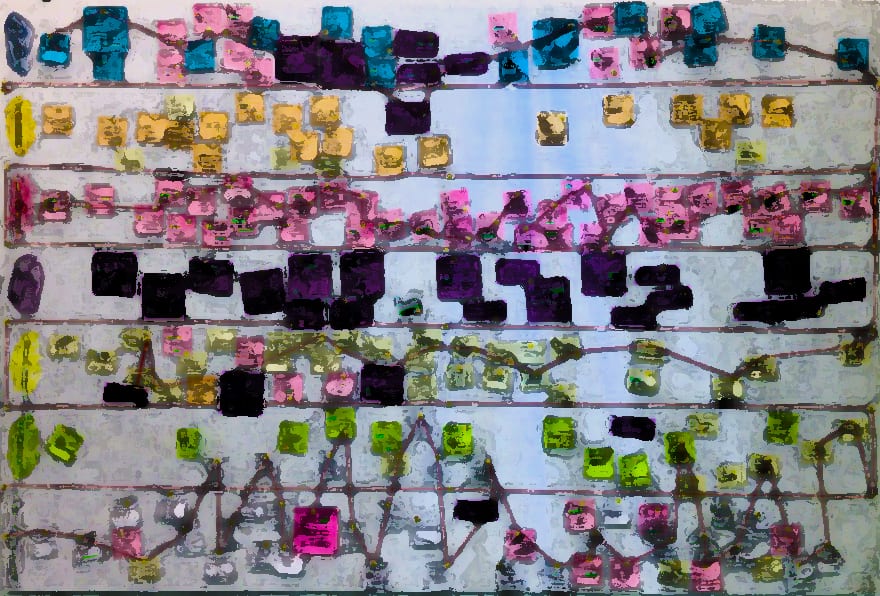
BOARD #1- Post-it note scene overview
The post-it note overview is a part of the planning process, that in the beginning, before story edits, actually looked like this (below):

After much rewriting and deleting, it now looks like this (below).

Still rather a large story. Each scene is given a colour according to theme and placed according to timeline and revised chronology after story structuring and re-structuring. Patterns across themes are easier to spot in this format, and it served a vital role in the scriptwriting process.
The process of planning, as represented on this board:
- Reading over diary entries from 2005-2007
- Group into scenes
- Add keywords of events, characters, place
- Create colour key to indicate theme
- Plot scenes on the x-axis
- Look for patterns
- Restructure according to script development

Each scene has a title and is allotted a colour indicating overriding theme. Some of the themes crossed into other areas, for example when the character found himself in romance in the workplace.

I attempt to also show how the different thematic areas of life affected the protagonist’s mental and emotional state with the use of red string, resembling a heartbeat, to indicate the ups and downs within the different thematic areas.

The first scene on the board. It always starts with family.
BOARD #2- Story development process
 Board #2 details the writing process, from diary entry collection through to the current phase of layout and thumbnails. It was challenging to present this in a visually interesting way, and the density of text probably prevented people from taking the necessary time with it.
The process of writing, as represented on this board:
- Stream of consciousness writing
- Dialogue & descriptions, getting a feel for it
- Group into chapters and send for critique
- Rewrite
- Work on premise, character web and story structure
- Rewrite Layout establishing pacing
- Image thumbnails

Post-it notes to guide the reader around, and give clarification on the process as it developed. Some of them were unintentionally poignant.
BOARD #3- Character Web

The third board gives an approximation of the central characters in the protagonist’s life, with their placement on the board indicating main thematic ties and emotional distance. The colours also indicate dominance, with romance and it’s intermingling with substance abuse taking up the lion’s share of the space.
Reading the character web
- The web of characters in the story
- Each in them in the area of their main thematic connection
- Territory of colour represents that theme’s impact
- Diary comics representing style and theme
- Character design and stylization
- The divide between discipline and excess
This board took a fair amount of planning in order to work out the best method of visual representation, as seen below:


 The work in-situ.


Information pages to help the reader/viewer with decoding the works