
Traditional art writing and critique can be broken down into a system of steps, including describing.
The description is crucial because it draws attention to the material evidence that substantiates any other claims. The four types of description are:
Impressionistic- a general impression or experience
Phenomenological- a critical approach to understanding. “Bracketing” our reading- why do I experience this? How do my background and upbringing influence my perception and reaction?
Biographical- where was the work produced, what was happening there at that time, and in the world in general?
Formal- the form and context of the work
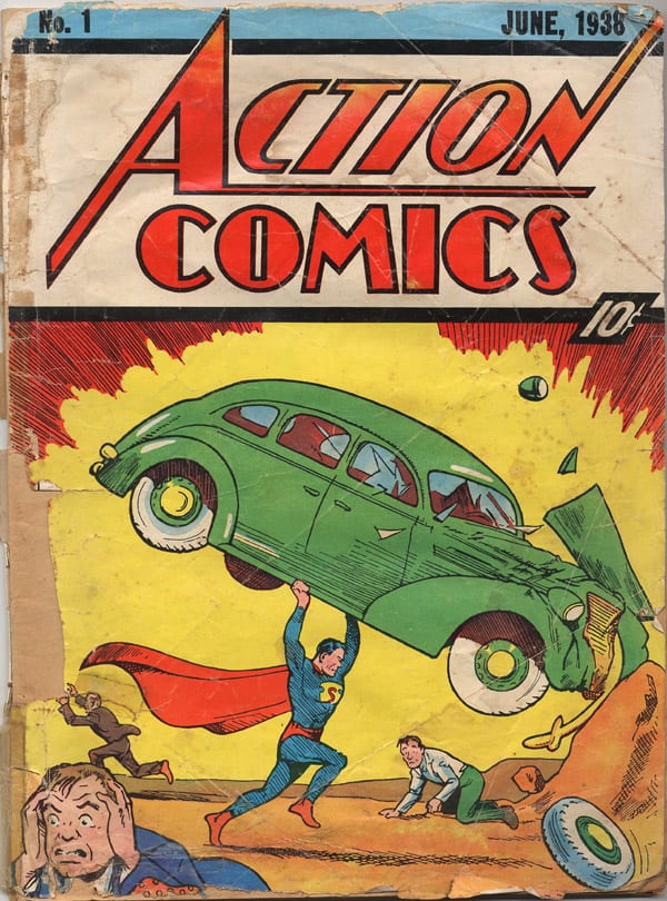
Let’s try these modes of description with an iconic image, the cover of Action Comics #1, the first appearance of Superman and the most expensive comic in the world.
DESCRIPTION
Impressionistic
My general response is to experience this page as action, as adventure and imagination. The fine lined shading, the strong black key lines and the bright colours trigger childhood memories. It is children’s literature, yet at the same time iconic and representative of something much greater than the single cover.
Phenomenological
The lines of action and the highly saturated hues give a feeling of excitement and visual interest. It is difficult to give a phenomenological response to this image as I am culturally positioned to recognise it. This is a work I know well and have built strong connotations with. It is the symbol of the beginning of a movement that survives to this day, stronger than ever, enjoying a critical and commercial moment in cinematic history as well as the medium that has become so closely associated with it. This is the birth of Superman, the first superhero of his kind. I’ll try to ‘bracket’ all that and put it to the side in order to move forward with a formalist reading.
Biographical
At the time of its American publication, the World was at war. Italy, Japan and Germany were posing a threat to the rest of the free world, not long after the first World War and just as the Great Depression was easing. These were obviously hard times, which may have acted as a catalyst for the creation of a brightly coloured Superman fighting on the side of good.
Formalist reading
It is a somewhat childish drawing, with large areas of negative space. The main object of interest is placed in the lower half of the page, with the action moving from left to right. The image is coloured in primaries with a secondary green running through the image diagonally from top left to bottom right. This secondary colour is a complement to the strong use of primary red and secondary yellow. This draws our attention to the car, along with its dynamic diagonal line and movement with the eyes, from left to right. The car is being lifted by a man in tights and a cape. I can see why people at the time this was released, similarly to the gentleman front and stage left, is running away. Losing his mind. The header text also contains lines of diagonal action, in eye-catching red with a strong black keyline, reiterating what the images make clear. This is action, of the fantastic variety. The composition of the page is top-heavy. The title, by way of its thick borders, carries a sense of weight. Moving down, fine lines emanate from the middle-bottom of the page, guiding the eye toward the main focal point. The car, a large sedan, is also a heavy object . Beneath it, the sole figure carrying all the weight of the page is surrounded with negative space, The setting is nondescript, and could easily be a desert or some wide open expanse of space. The juxtaposition of men dressed in business attire and a costumed man holding a car aloft within this space may have been a purely aesthetic choice, not tied to the story but entirely to allow the eye to take in this image clearly and quickly.