
I set myself a challenge to produce a birthday/mother’s day card within eight hours, in order to give myself a chance to post it interstate the next afternoon and have it arrive before the weekend. Of course, inspiration struck as it often does at the least convenient times, and during planning, I thought, why just make a card when I can produce an eight-page comic while testing out an altogether untested technique? Well, that’s not what I thought initially, but that’s what it turned into. I started, as with most of my comic projects, by sketching out ideas in my Moleskine A5 notebook.There was also a poem as well, which I’ve cropped out because there are limits to what even I’m prepared to share. But a poem seemed to be required, as I was overcome with the enormity of realisation of the miracle of being born and the hard work that goes into being raised to be a decent human being. Some things warrant a soppy poetry comic. The next step was drawing these images out digitally, using Manga Studio. This stage was kept super rough and loose, as I still had the illusion I would be able to get all of the pages finished by lunchtime of the next day.

After creating 10 of these fully illustrated pages I slept, because it was 2am. I had definitely gotten caught up in the moment. The next day I printed the digital pages out, compelled to follow through on my envisaged workflow. Of course, I couldn’t find my light box, so I had to improvise.
A moment of inspiration, and thinking outside the (light)box.  Like so. The act of penciling went pretty quick, and I was still under some illusion that I might get these things done within a timeframe that would allow me to post them to Brisbane before the weekend. The cool thing about working this way is all of the choices in composition and layout can be made and refined in Clip Studio, where it’s easy to work at whatever size; either thumbnail or zooming in, micro or macro scale, while freely cutting, pasting & transforming, all easy in digital mode. The penciling over the top then becomes about making choices on line quality, and rendering things like hair and cloth, while trying to capture things like overlapping volumes. That’s a lot of fun. Of course, working on the window is a bit of a strain on the shoulder, which took me back to undergrad life drawing days.

Faffing around for so long on all of these steps I forgot how long it takes to apply inks, and it was getting late in the afternoon by the time that was all done. By then I had to prep for teaching the next day, and I had to concede that this little project would not be done anywhere near on time. This gave me an extra window of time to test the part of this workflow I wasn’t familiar with, creating the look of watercolour by digitally manipulating ink washes. I saw this technique in Tim Sale and Jeph Loeb’s run on Daredevil (below). Colour is not my forte, so having the ability to change, edit and modify, while controlling value directly in the first instance was super appealing. But could I pull it off?

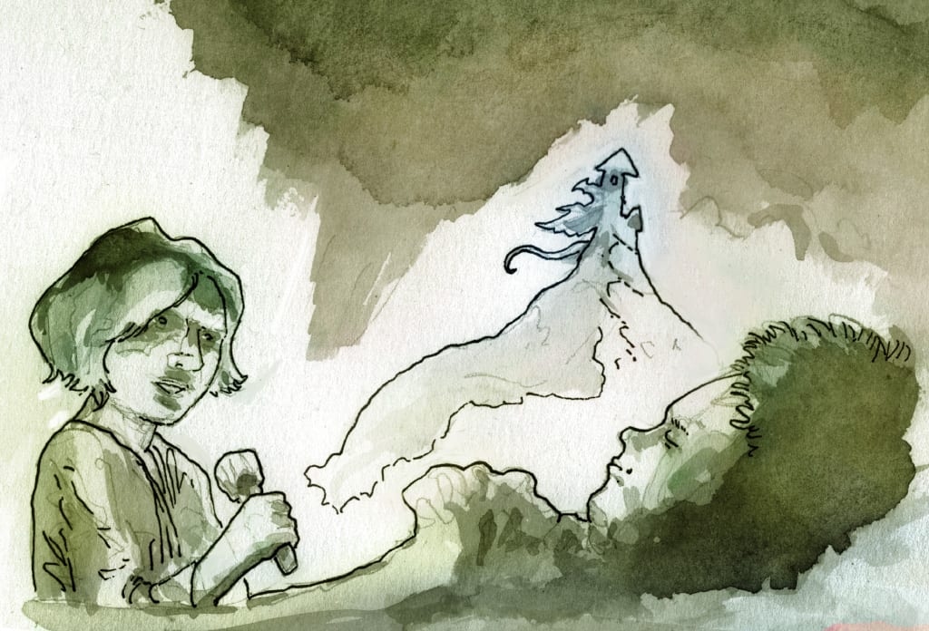
In the end, I’m pretty happy with the result. Colouring digitally over an already established value scale and washes i surprisingly quick and easy, and some of the images, such as the one below, only needed a quick gradient. The main problem, as with any art I suppose, is knowing when to stop. It’s so easy to play with blending modes, and there’s always the option to add one more gradient at a low opacity, or one more correction layer, or one more filter.

My next mini-project which I’m ready to blog about soon will use more or less the same workflow, but probably with a bit more refinement (and time) in the colouring stage. If anyone is interested to see more about any stage of the process, please let me know and I can look at making a bit more of a basic tutorial post. Otherwise thanks for reading, and remember to be good to your mum.