
The next few posts will look at some of the things I’ve been drawing in my free time lately and break down some of the key things I’ve learned. In the page below from Life in the Gutter, I decided to use a variation on my most recently discovered and preferred workflow. First I print out the digitally drawn image onto nice thick A3 paper at a low opacity, as below.

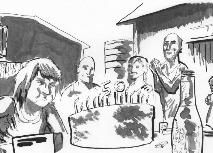
The next step was to apply ink washes. I didn’t take any snapshots along the way, unfortunately, so you’ll have to take my word for it. I had just been reading Anatomy of a Crime by Lark, Brubaker and Phillips and wanted to recreate a dark page. I probably should have chosen a scene that isn’t set in the afternoon. I started with applying washes for shadows, and then brush strokes for key lines, working from thick to thin, the reverse of my usual process. Working at this larger size meant I was a little careless with the brush, and it’s not as controlled as it should be. I’m not used to working so large. Then I thought I’d put in floor tiles, riffing in ink, which never turns out to be a good idea. The end result is a confusing mess. Visual vomit. 
The next step was to clean up the page. Blue shades were removed using Photoshop and dirt/imperfection specks were airbrushed. Still a mess. The eye doesn’t know where to look, and more importantly, there isn’t any incentive to take the time to figure it out. Before I start the page again, I thought I’d try to clean it up further digitally, to remove unnecessary details.

Below is the final result. I’ve selected the largest areas of shadows, particularly in the background, and lightened them up a little to help push them back. I’ve also selected and removed all of the ad-libbed ground detail which was just distracting. I’ve also done some extra small bits and pieces of clean up, adding some rim lights and thinning down some of the over zealous brush strokes. It’s far from a perfect page, but it’s definitely an improvement and means I might not have to start again from scratch.
![]()
One of the keys to art is allowing enough negative space for the eye to ‘rest’ and to balance all the positive space. Although I know this stuff, basics of basic as it is, I find it interesting that I continually go overboard and temporarily forget these foundational art essentials. Back to the drawing board…