
Continuing on from my post about reference or cheating, here is some more progress on the pages for Squishface Studio’s upcoming anthology, Squishzine Brunstown. After printing out the digital reference drawings in a faint blue line I draw over the top using a few fixed line width pens. I think between a 0.05 and 0.4, on A4 paper, as below.

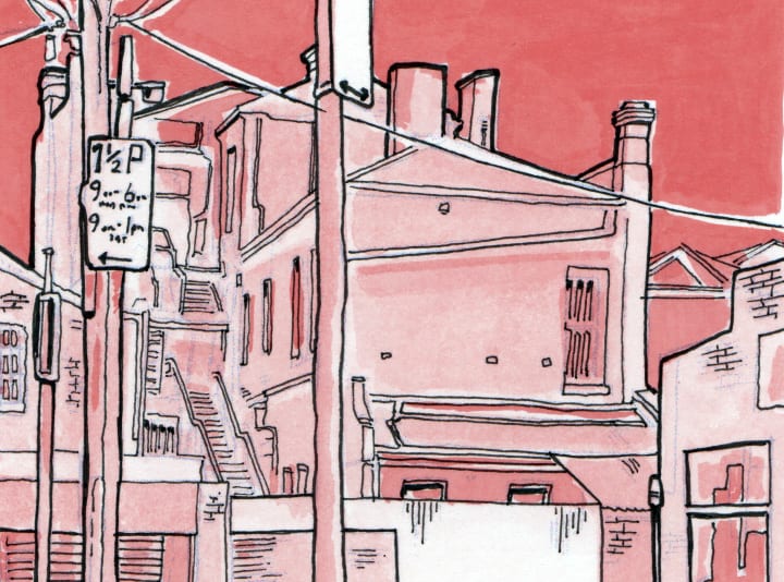
Some really interesting buildings in and around Brunswick, in Melbourne Australia. Cultural capital FTW.
Then these pages are scanned and the linework changed to blue line, as below. The blue line is part nostalgic hark back to a time of non-reproducible blue lines for old school printing processes, and part embedded workflow. Beats working over a light box.
These pages are then printed out, and ink washes applied. I’m aiming for a feeling of night-time, which I haven’t attempted before. It’s not bad, not fantastic, but passable. Next time I need to be even bolder in my value, and perhaps invest in thicker paper that can hold more water. The point of the multiple scans and prints is to have two separate layers, line and tone, for a risograph printing. Again, this is a first for me. I’ve put together a quick digital composite to have an idea of how it might turn out (below), but to be honest I have no idea. @samueltemery is kindly putting together a test on the real thing this weekend. The washes may fail to translate through the risograph process, in which case we’ll have to go digital, and try solid blacks and hatching next time.
 ![]() Any thoughts or comments as always are very welcome.
Any thoughts or comments as always are very welcome.