
The second Aztec god in the Entwined roster that I gave a design overhaul is Death/Lightning, the deity formerly known as Xolotl. Dr Mike describes him as “a body hanging in a distorted electric chair. Bitter and vindictive and sarcastic, like a failed comedian.” Below are a couple of Mike’s renditions of this bitter comedian of death.

All of the Aztec gods in Entwined have a vertical composition, through different devices. In this case, the extended electric chair. While Mike has only used the gods as springboards for all new designs, I’ve once again revisited traditional art and representations. Partly for reference material in taking these designs and creating something new, and partly because it gave me a solid goal for Inktober. Plus, I like it!
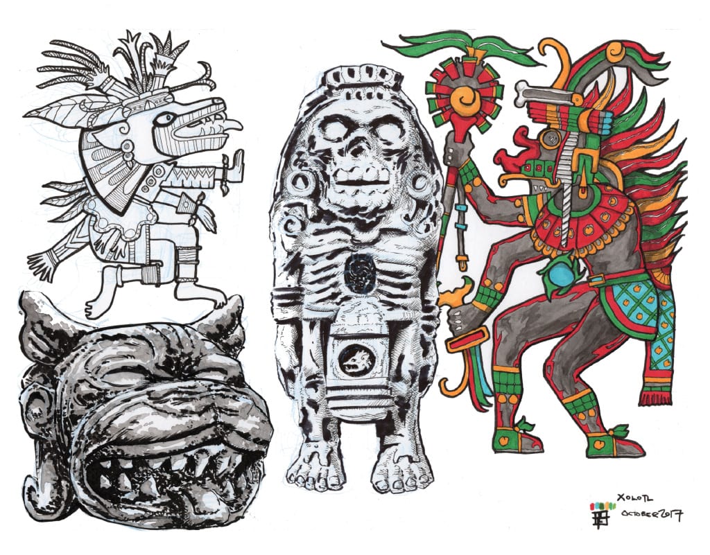
Like a terrible student, I didn’t take down the details of the reference images, but they are all the result of a quick Google image search of Xolotl and shouldn’t be too hard to find the sources if you’re interested. I chose this guy below because I liked the idea of a god made of stone. I think I chose a few for this reason, as well as for simplicity of the design. Many of these Aztec renditions are detail-heavy and it often becomes near impossible to pick out singular defining visual traits.

This one came out pretty good. I used a brush loaded with ink over a quick blue pencil sketch, kind of dabbing the side of the brush and focusing on capturing shadows instead of lines. Once the ink dried, a quick wash added mid-tone, loosening up some of the solid ink to quite a nice effect. There were some happy accidents as a result of this process, including the teeth at the bottom of the mouth. As I found when practicing watercolours, it is important to leave some of the paper untouched as these become highlights, or clouds, or reflections on water etc. They help to add form and provide negative space that allows details to be read more clearly.

This fellow below has the hallmarks of traditional Aztec art (flat side perspective, a variety of patterning and packed with detail), but with a certain restrained simplicity. I also like the representation of the hound, which is an aspect of Xolotl that I tried to work into the more finished designs.
Just a line study looking at patterns and capturing the flatness with some consideration for varying line widths.
Again, this was chosen for its variety of style and possible approaches I could take from it. This guy really looks like a herald of death, with those teeth and skullface. I also like the cap details and the solidity of his limbs. Engrossing hatchfest with thick key-line.
And below, a prototypical rendition of an Aztec god, although with a somewhat more sinister veiled visage. And backward feet! Something so simple carries with it so much of the sinister and horror-filled. Reminded me of a ghost story I was told once, about a hitchhiking woman in a white dress with backward feet. It scared me then and it still works now.
This one was first drawn, as usual, in blue pencil, and then drawn over in a 0.3 fine line pen. Then I used Copic markers to colour in the red, green, orange and blue areas, deciding to use ink washes to fill in the black areas, as well as to provide a suggestion of shadows and attempt (not very well) to add some depth and volume. This was the first time using ink washes over Copic markers and I was happy with the result, neither tending to dominate or wash out the other.
With those exercises out of the way, I could focus on taking Dr Mike’s designs and bending them a little sideways. First I referenced a dog’s skull and put an electric cap on it. Hatching got out of hand as per usual. I added some of the head flairs from the stone dog’s head into the cap, probably the only thing from this that I liked.
Just to check how this design might look in profile I had another go, but extended the snout to create something a little more grotesque. And maybe, I also didn’t observe it correctly in the first place. I’ve added the staff-head from the coloured reference above and dialed back the little cap flairs. While I wasn’t in love with this one, it was still fun to draw and indulge my infantile connection with monsterish creations.

Moving towards something usable here- a little less dog and a little more humanoid, although still retaining the canine pointed teeth. I also added some details from the little herald of death sculpture with the chest cavity, and some frivolous face details from the coloured reference, just cause they’re cool. This one is recapturing some of that playful idiocy of Dr Mike’s original vision.
And the final (for now) iteration of Death/Lightning. I’ve taken bits and pieces of reference from all of the above and created something somewhat new in the doing. This was drawn in a simple one point perspective, added in as an afterthought when I realised the chair necessitated the illusion of depth. Which is why it’s not quite right, but at least serviceable. The backward feet add the right touch of creepiness, and he still manages to look quite jolly at the same time. 
The next iteration will turn this chair into something more vertical, and electric, and who knows- maybe I’ll just go back to the originl version. It would certainly be simpler to draw!