
Somehow, despite a series of blog entries outlining the design process of the Queen Sparkle commission (found here, here and here), I didn’t yet get around to posting the finished thing. So here it is.

This was put together with the intention of creating a Risograph printing, which is kind of like a machine screen print, with different printing layers. I make these decisions for the sake of a better outcome, often inadvertently making my life harder. Viva la stubborn artistic pride! The first step was printing out the digital design on A3 paper and pulling out the ol’ A3 light box. I traded this from a fluoro tube light box and this one is quite nice to work on, being LED lit, completely non-heating and silent. This was doubly good as I decide to tackle the inking of this beast at Squishface Studio during a somewhat impromptu 24-hour drawing challenge. If you’re interested in the process, here’s an overview.

Barely started at 10am and already I’ve made a mess.

Beginning with tracing the linework layer, using a mix of brush and technical pens.


With the line layer locked down, I started on a new sheet to tackle the ink washes. Meanwhile, the team were hard at work!

Sam T. Emery of Tree Paper Comics pulling apart and servicing Squishface’s resident Risograph printer.
And the late night crew, Ben Hutcho, Jess Parker and David Nixon.

And getting started on a fresh sheet for the ink wash stage. I think at this time it was already getting pretty late. These things take a while. 

The first stuff-up. A healthy reminder not to use paper towel to dab up excess ink wash, as it messes the paper. Still, it was well past the point of no return by this stage. 


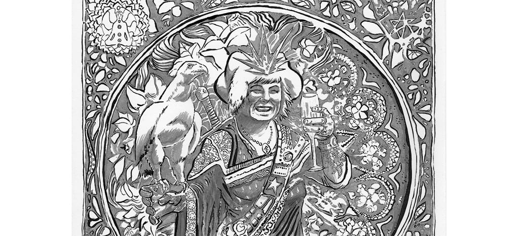
 And the finished lines and ink washes. I still can’t quite believe how long it took. But there is something magical about drawing and working on one piece for that one consistent duration. There’s a special flow state that I enter that’s like nothing else. Transcendent. Seeing patterns within patterns. Level up.