As I draw closer to finishing art duties on Entwined I’ve been testing ways of speeding my colouring workflow. Here are a bunch of colour tests using gradient mapping, a feature of Photoshop and Clip Studio.
Creating gradient maps and colour schemes for a cast of Aztec Gods. Platonic ideals, in Plato’s philosophy, are the first and perfect templates of everything we encounter in the physical world. These characters reside in what Plato called the Hyperuranion, literally a ‘place above the sky’, where everything exists in a state of perfect essence. Now, what colour is that?
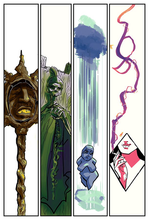
Different line types work with different colour schemes and intensities of saturation. Where should it be vibrant? Can the colours change to reflect the character’s state of mind, their shape? There are no rules!
The first rays of sunlight. This is a quick and lazy quick colour using only a gradient map with no modification. Values take care of the rest. Next step is to look at reference and add glow effects and sparkles. Frozen dust molecules.
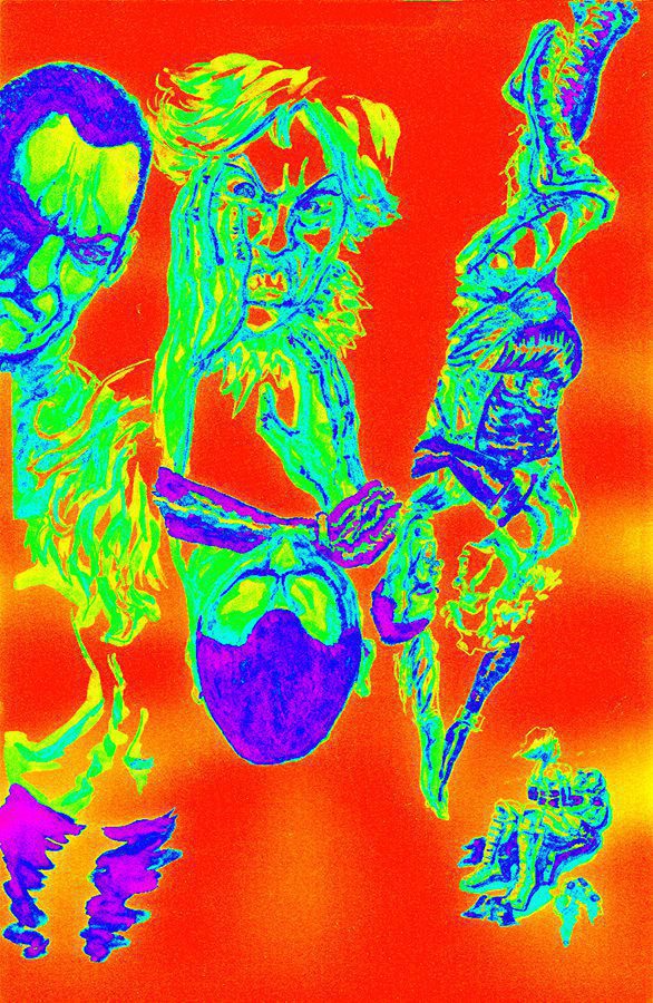
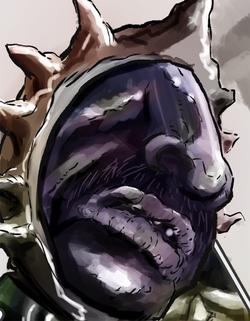
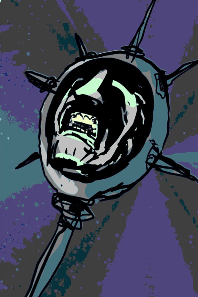
Death/Lightning and The Smoking Mirror. Here I was really quick with a broad and loose colour application in Clip Studio, definitely not staying between the lines. Clip Studio’s Machine Learning – Colourise produced a passable, painterly colour layer from my scribbles. Welcome to the future.
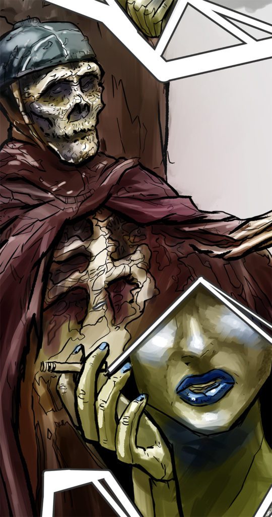
Minimal painting over the top didn’t take long, and was confined to bits and pieces, like the blue in Smoking mirror’s, and a bit of cleanup. Not a bad result for a process that is much quicker than one involving manual flatting of colours.
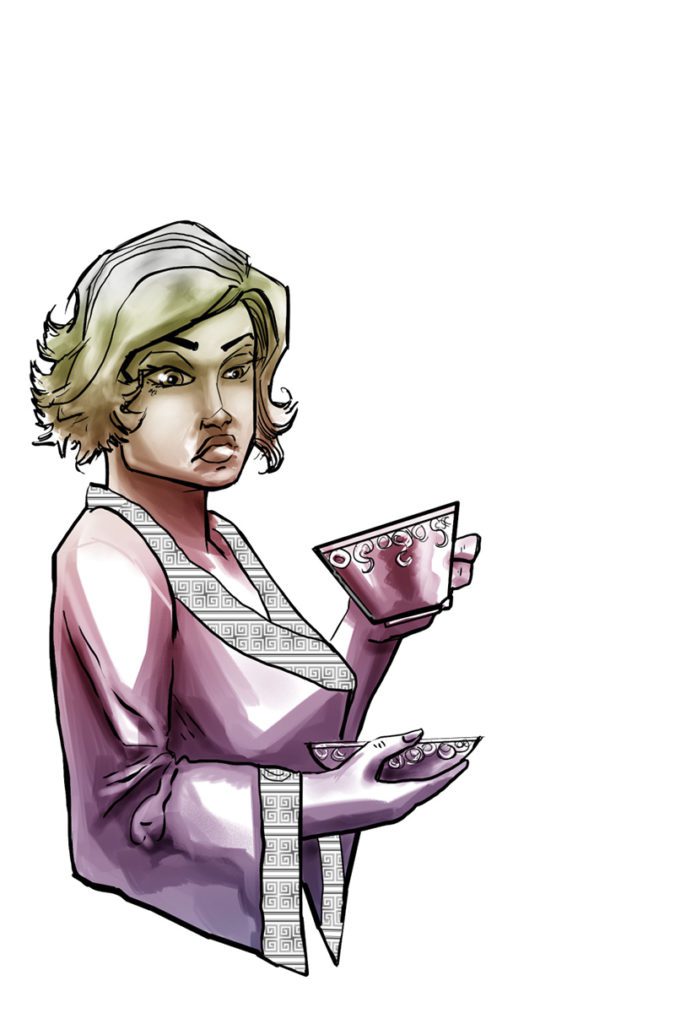
Bette Rogers came up nicely with just a single yellow-purple gradient set to Soft Light. This worked out on the first go. Pure luck.
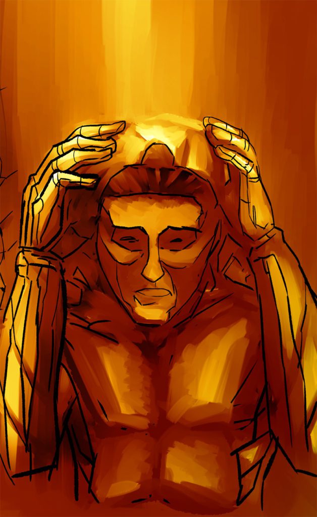
For Alejandro Vargas its a gradient map over strong values. I can work into this much more, including loose colour flats combined with the Colourise function so he’s not literally just bathing in a golden shower.
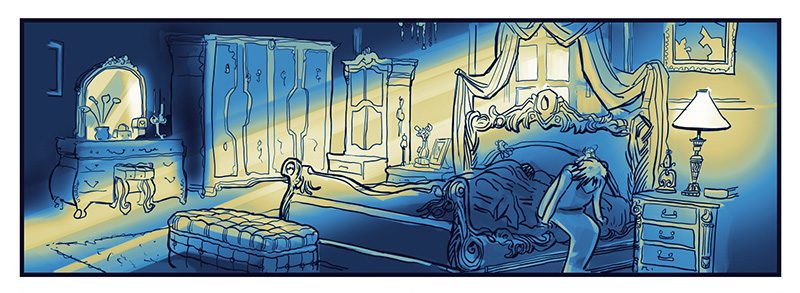
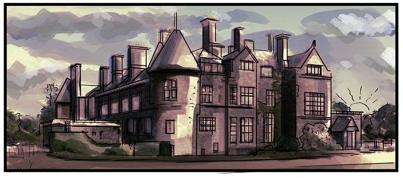
The ol’ Air BnB. This one’s a stack of semi-transparent reference image set to multiply mode, line layer, and the value painting. A Yellow-Blue gradient map with the reference colour coming through and it’s about half way there- I’ll paint over this so to make it my own.
Gradient maps aren’t always a surefire method of colouring. Here’s one of my very first tests using a default Gradient in Photoshop. Hope you enjoyed, let me know in the comments if you work this way and if you can give me any tips!