I grew up enamoured with Monkey Magic. Something about the liveliness of the show, the kooky characters, the music, the absurdity of it, as well as the occassionaly powerful and poignant moments. Monkey trying to traverse the Buddha’s Palm was a big one for some reason. This show had an influence on me, which manifested in 2011 in a comic collaboration which you can check out here- https://www.darrencfisher.com/2021/09/16/journey-to-the-west-2011/
Now on to the point of this post, an overview of process on this drawing of Sun Wukong, from A5 sketch to finished digital illustration.
Starting with a ‘quick’ sketch of Sun Wukong, legendary figure of the Journey to the West. I used a blue animation pencil in an A5 sketchbook. Usually I might leave it at that, but since I was drawing in the expensive book, and i liked how it was shaping up, I decided to continue.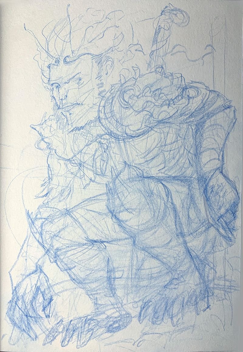
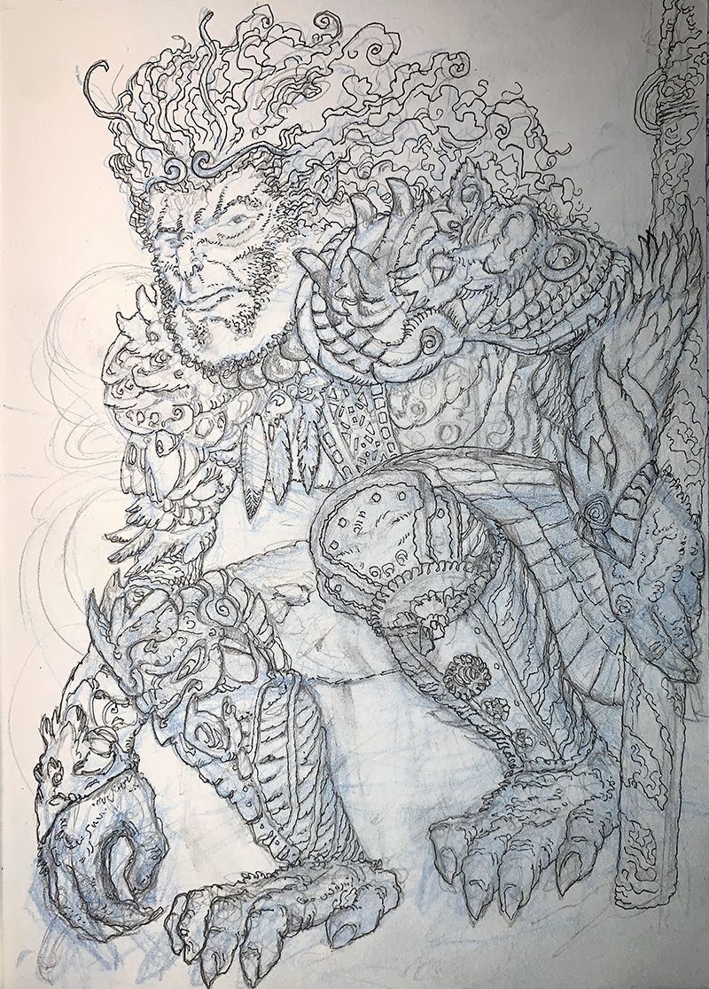
Refining details with an HB mechanical pencil. This is where i start to think about details in preparation for inking. I still keep my linkwork quite loose at this stage as I am still feeling my way around. A lot of the smaller shapes reveal themselves and I am forced to soon look up some reference so i can figure out what his armour and other details should look like.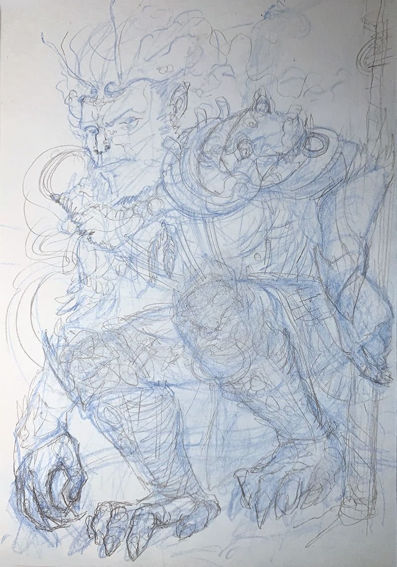
Using a 0.1 fine liner pen to pull out details and some textures. This part is really time consuming and quite therapeutic. The process is a mix of technique and intuition. I need to pay constant attention on a lot of things at the same time. How each new line affects the balance of the lines around it, and how they affect the overall composition. Making sure I don’t build up too much in one area at once. Making sure there’s still some negative space in there. Looking to capture some rythm, a bit of energy, that things make sense as 3D forms wrapping around, that things have a sense of form. There’s quite a lot going on and it can be completely absorbing.
,
Here I’m using a slightly thicker 0.3 pen to pull out some overlapping forms, as well as create more visual variety. At this point I’m painfully aware of how constricted the drawing is in the A5 page, and starting to consider if I continue with this here or give it some room to breathe. I’m pretty happy with it as a standalone drawing so decide to scan and move to digital. 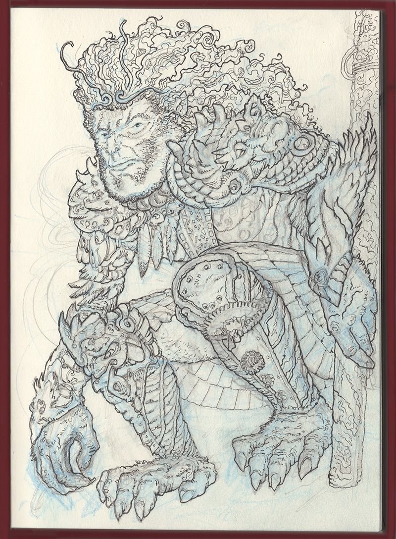
One of the big advantages of working in the digital space is being able to flip the canvas. It’s like holding the drawing up to a window looking from the back of the page. Asymmetries that emerge seem obvious, but for some reason were impossible to see from the ‘right’ side. This is a big help to spot issues with composition. From there I started roughing out some possible directions for the piece. Quite a few false starts and versions to never see the light of day were made, before settling on this.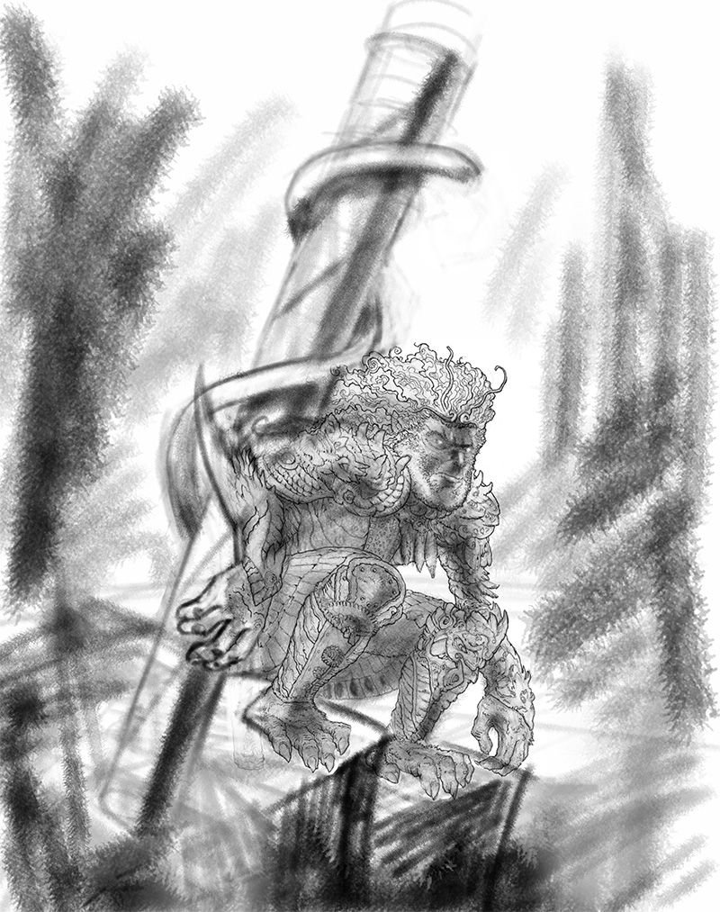
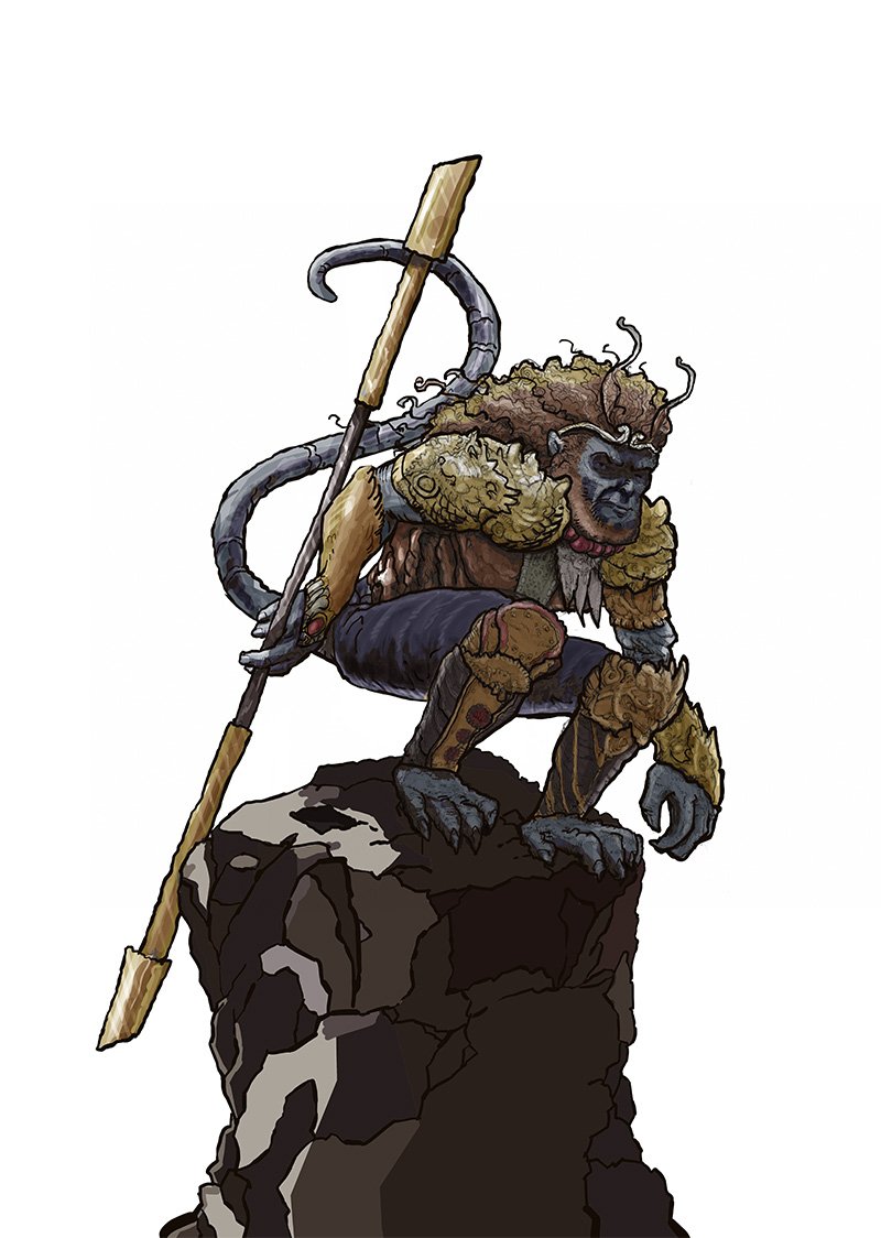
Then I’m re-inking the drawing digitally and adding bolder lines. I also went with the idea of Monkey perching on this column of rock, tinkered with his staff, and changed the hand position to help sell the idea that he’s supporting the weight of his staff, which i knew still needed a lot of work.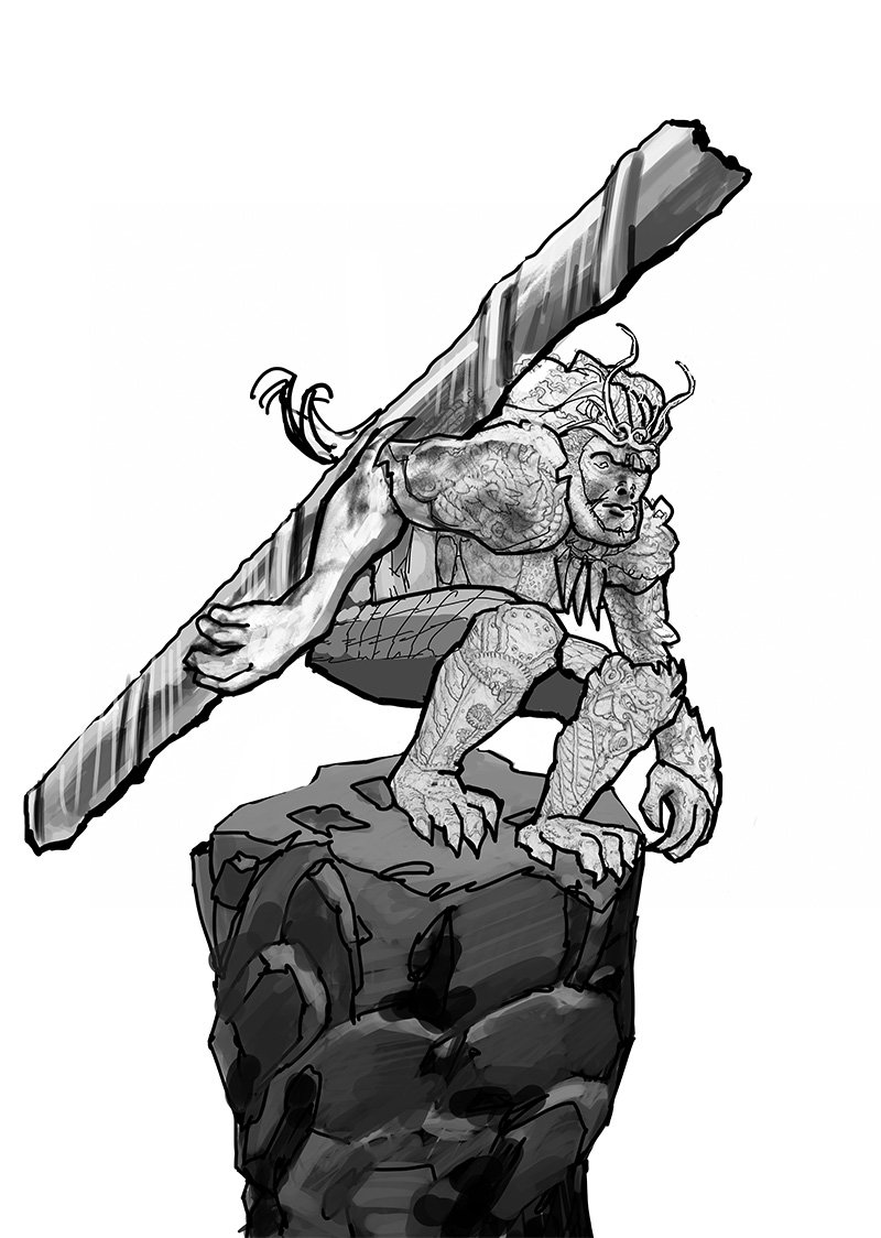
More refining, more tinkering with the staff and hand. Plus he got a tail. This felt pretty good in general, but a bit ‘busy’ with all the different grayscale details. I enjoy doing all that intricate stuff but sometimes it gets out of hand.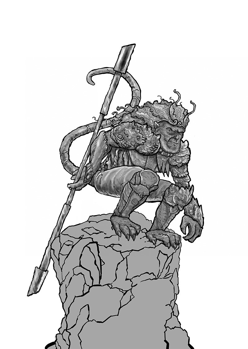
Adding some darker and consistent values with more solid areas of light and dark. He’s already looking more unified than before, and although stylistically different, i was happy with how the rock turned out.
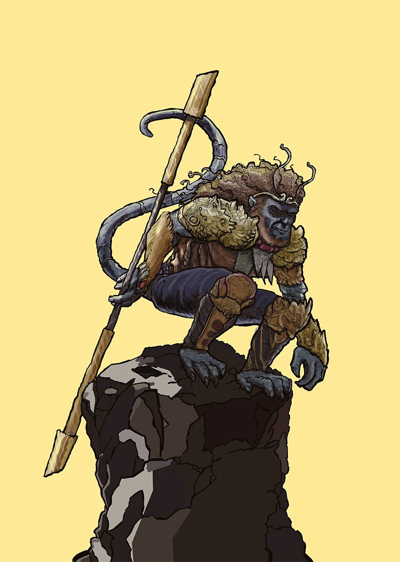
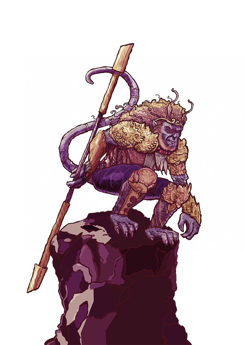
Adding colour on a ‘soft light’ layer. I made the values quite dark because I know this blend mode lightens the influenced layer. Below are some variations. I’d love to know which you prefer, and why.