I’m talking of course about redrafting Life in the Gutter, my 300+ page graphic novel draft which you can read here. I have spent chunks of time here and there to ‘upgrade’ the pages from draft version to finish. One of the problems is that these chunks of time are spread so thinly that my ‘style’ and preferred approach keeps changing. I realize that’s always an issue with longer-form works. But my available time (like most people) is scarce, I’m not sure I’ll be able to sell this to a publisher, and the zest for working on it may have left me.
Do I really need to work on this anymore, or has it served its purpose? Life in the Gutter provided a cathartic experience in semi-fictionalizing a difficult time in my life. By going back to that period and viewing it from different angles, I was able to get a new perspective of sorts. Truly put it behind me. The story also helped me exercise things I’d learned in the doctorate, and get my qualification, which has had a huge impact on my life and career. Maybe that’s good enough?
Self-rebuttal coming up
Yes, it takes time to work on these pages. But it’s already come so far, it does seem like a bit of a shame to stop now. My style changes- and maybe that’s alright. There’s no gun to my head forcing me to stay consistent. I can continue to use this to experiment and try new things. And there’s no way to be sure this won’t be appealing to a publisher without trying. Why give up before I even make a decent effort?
There’s still revision of script and structure needed, and minimum changes throughout including hand drawing panel borders and hand lettering. But I was surprised when I re-read the draft that it’s actually quite engaging. So here I am at my impasse. To help, I’m going to compare some pages from the DVA draft to the most recent changes. I’ll annotate what I’ve done, and perhaps somewhere along the way, I’ll gain a better idea of whether this is worth sticking with.
Alright, let’s go!

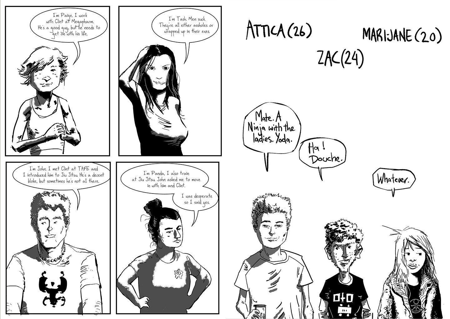
The original draft had each character split into separate panels, redraft has them split into groups. I can’t really remember why I did this, but I think there’s a better flow as a result. This draft also adds the character’s names. The inspiration for this interstitial 4th wall breaking was Alex Robinson’s Box Office Poison where it helped flesh out the characters in interesting ways, as well as break up the chapters. Box Office Poison is a great graphic novel, and if you’re into real-life type stories and comics in general I highly recommend it.
The Copic debacle

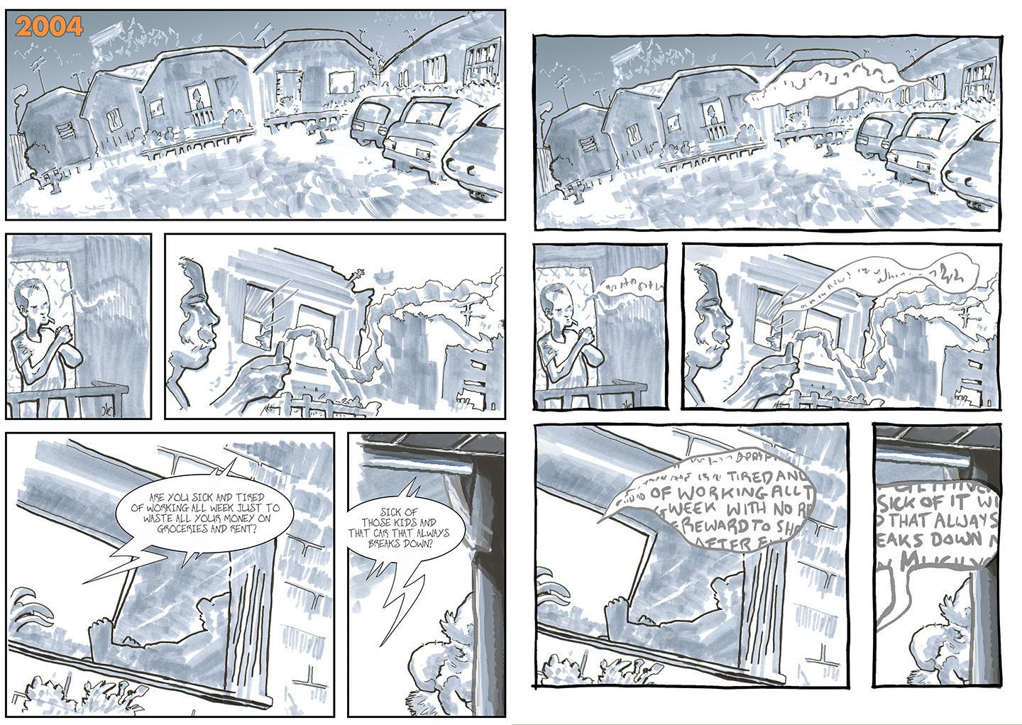
The early, Copic marker pages. These ones were some of the first I turned from digital to traditional during the doctorate, I think I had a lofty ambition of getting the whole thing drawn in this style at some point. That was quickly abandoned as the page count continued to rise into the hundreds. Someone really should have stopped me, but hey, as above, the process itself was worth it.
So here I’m going back to digital, redrafting the panel borders, lettering, and some small touches here and there. I didn’t want to change the look of these pages too much; as a general guide the redrafting is done with speed as a priority, and it’s easy to change things that don’t need changing. But I did try some different things here, with the thickness of panel borders, and different filters to change the look, before sticking with the original Copic marker style.
The A3 inkwash experience

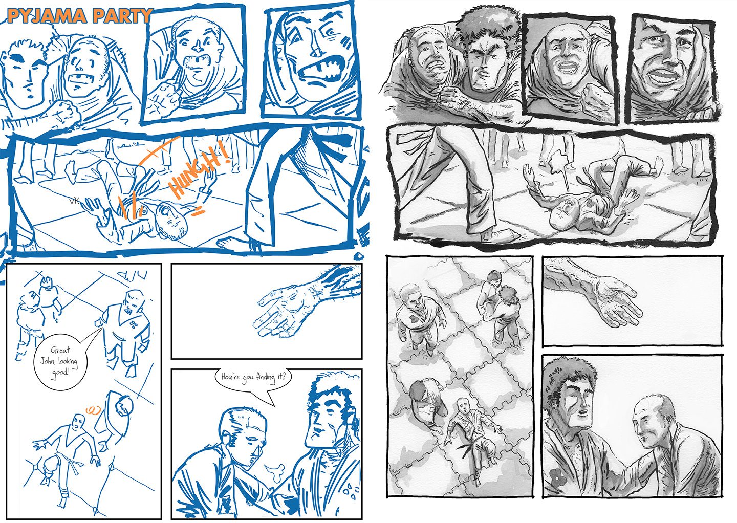
This page is indicative of the most drastic redraft variation so far. I printed the digital draft for these at A3 and went over everything using pen and ink wash. Unfortunately, it was super time-intensive, and during the process, I realized that a lot of my digital drafts were super rough. So I needed to do tighter pencils on the page, and work out perspective, look up references, and all the other things that are just easier to do digitally.
I persevered for a handful of pages before giving up on this approach; it’s a great finished look but totally impractical for this project.

Now this page is a good example of some positive aspects of redrafting. A few panels were ‘flipped’ digitally before drawing on paper, to give a better flow- more from left to right than right to left. This was one of Frank Quitely’s main advice points when I visited him back in 2014, and it’s stuck with me since.
The rest was more or less a matter of just going over the digital draft, although you can see I ‘ve gone for a slightly more realistic interpretation of the characters- something I’ve since gone back on, now preferring a stylized look. As I said, the style always changes, whether a result of improvement, or regression or simply by changing aesthetic preferences.
Going full digi-native

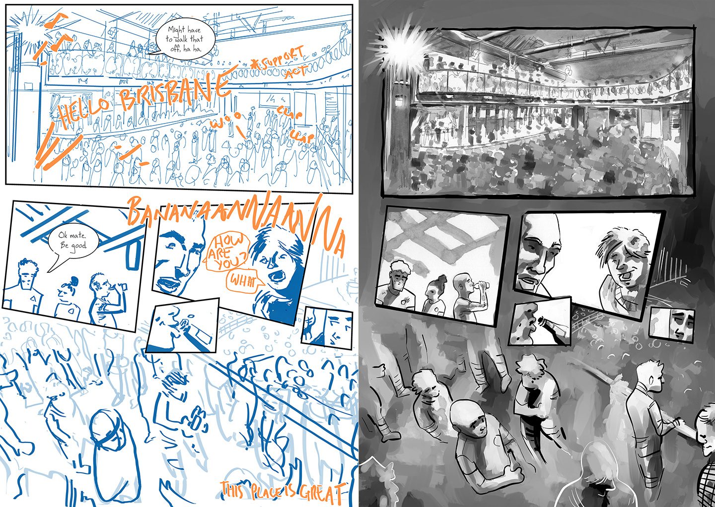
This is where I started to redraft digitally. I guess it happened sometime after working on Entwined, where I got a little more confident with digital painting. It was likely prompted by just not wanting to redraw that crowd scene and balcony shot (I had to anyway), and a need to fix an initial attempt at traditional ink washing which didn’t work out well. You can still see some of the original ink wash in the second-panel roof beams, but most of it has been painted over.

Here I’m settling into the digital redraft. Some pages I’ve coloured where it helps with mood, or to bring important things forward. It’s actually pretty easy to colour like this, just using gradient maps and some select painted colours. But in general, so far I’m sticking to black and white. If this ever gets published, odds on it’ll be in black and white.
It’d be too expensive to print otherwise, and the market for unknown autobio comic authors is not huge if you know what I’m saying. I’ve still got boxes of Storybordello diary comics gathering dust under the house from five years ago, that I may never get rid of. Why would my graphic novel be any different?
Uncannileering

Pages like this, I just don’t know. Because I used some photo reference here and there, there’s the occasional bit of ‘uncanny valley’. So do I trim it right back and simplify all over? Perhaps if I just add button eyes (actually that’s not a bad idea now I think of it). This was a boring page to finish, and at the end of it I was sure I didn’t want to do this anymore. But then I looked again, and thought, it is actually quite nice having this a more finished page. Not perfect, but legible at least.
Summarise or ninjas (read out loud)
So there we go, a small selection of page changes and the process so far. There’s a temptation to just leave it at the digital draft stage, but I know that’s not good enough for general consumption. Although works like Lucille by Ludovic Debeurme use minimal line work to tell the story, that works because the artist is a master, and the minimalism is intended. In fact, I was so impressed with this approach I wrote about it here. For me to just pass a rough draft as ‘intended minimalism’ would be too much blag. I couldn’t live with myself. And no one would buy it anyway.
So there we go. I’ve gotten to the end of that and still have no idea what to do. What do you think?
Want more Life in the Gutter?
24 hour comic challenge art ashcan autobiography aztec cats characterdesign christmas collaboration comic comics copic copics coronacomic cycling diary diary comics diarycomics digital drawing driving entwined entwinedcomic europe flying graphic novel horses illustration ink love man flu planning practice process research sequential art storm swinburneuniversity taiji teaching timelapse universegun watercolour workshop writing